Daniel Heintzman
robinhood icon

Robinhood

Case Study: Collections

Robinhood header image

Overview

At Robinhood, I had the opportunity to work on a variety of new projects including features before the launch of two new products: Robinhood Crypto and Robinhood's web app.

In addition to these new products, one problem area I focused on involved helping the subset of Robinhood customers who sign up to Robinhood but don’t end up investing with the product.

In the end, a solution for three key areas of the product was designed to make picking investment opportunities easier to understand, accessible, and more convenient.

Problems uncovered from user research

As with many mobile apps, a portion of Robinhood’s user base is taken up by inactive users. In the months leading up to this project, a study by our user research team was conducted in order to understand the underlying reasons behind why Robinhood's new users become inactive. Reading through these findings, I learned when new users are looking to invest, their main hurdle is deciding which stock they should invest in first. There seemed to be two main reasons for this:

The first reason was that Robinhood lacked the tools necessary for users to discover stocks on their own. When users are first using the product, it is very common for them to say "I don’t know what stocks are available to invest in on the app".

The second reason was due to users lacking confidence. With the exception of current and former professional traders, almost all users say they are "not an expert" and don’t feel educated enough to invest for themselves.

Goals

These two problems of stock discovery and user confidence informed the goals for this project.

The first goal was to enable new users to easily find different stocks to invest in. The second was to improve education in order to help users feel confident and empowered enough to invest themselves.

Understanding where we’ve been

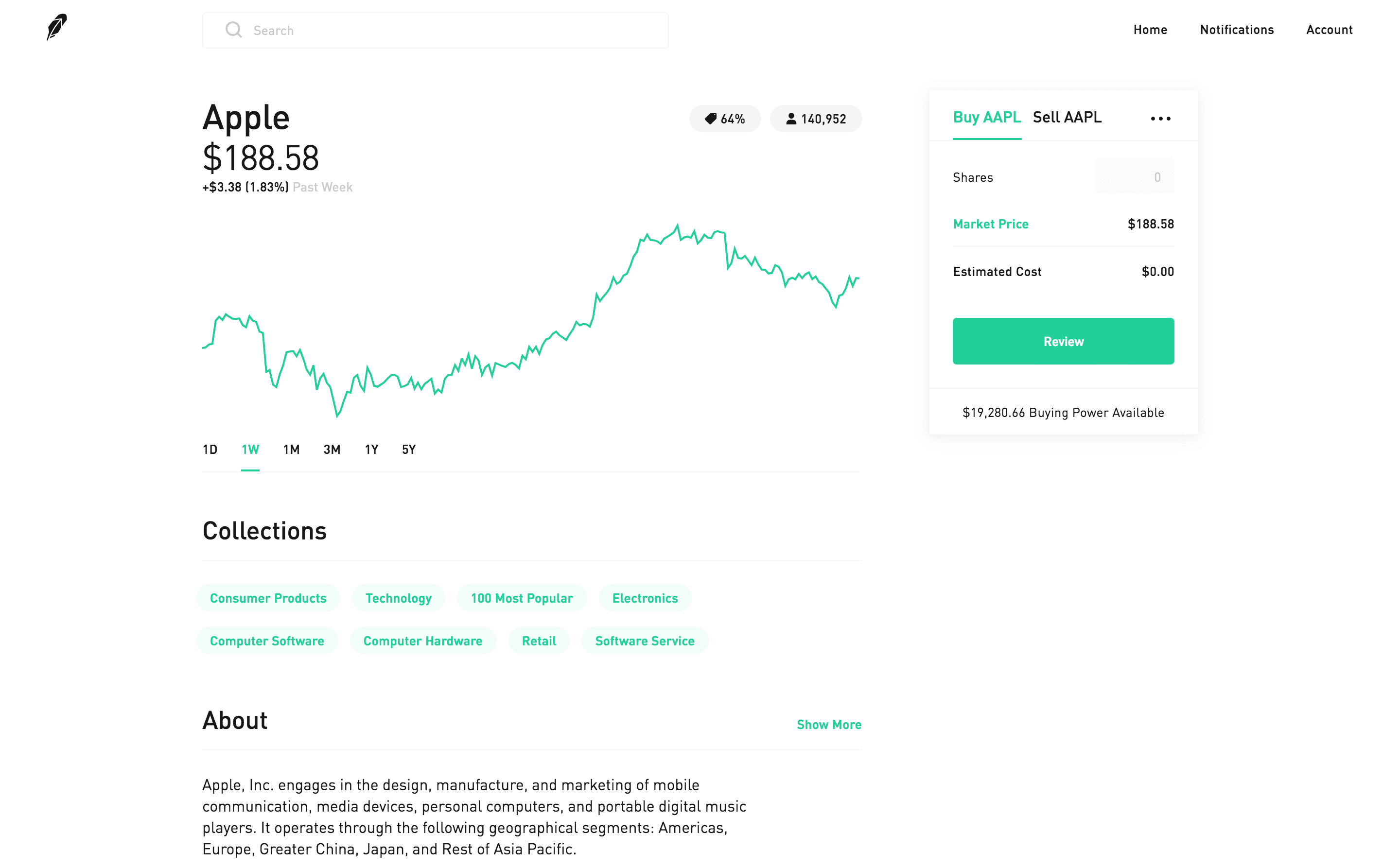
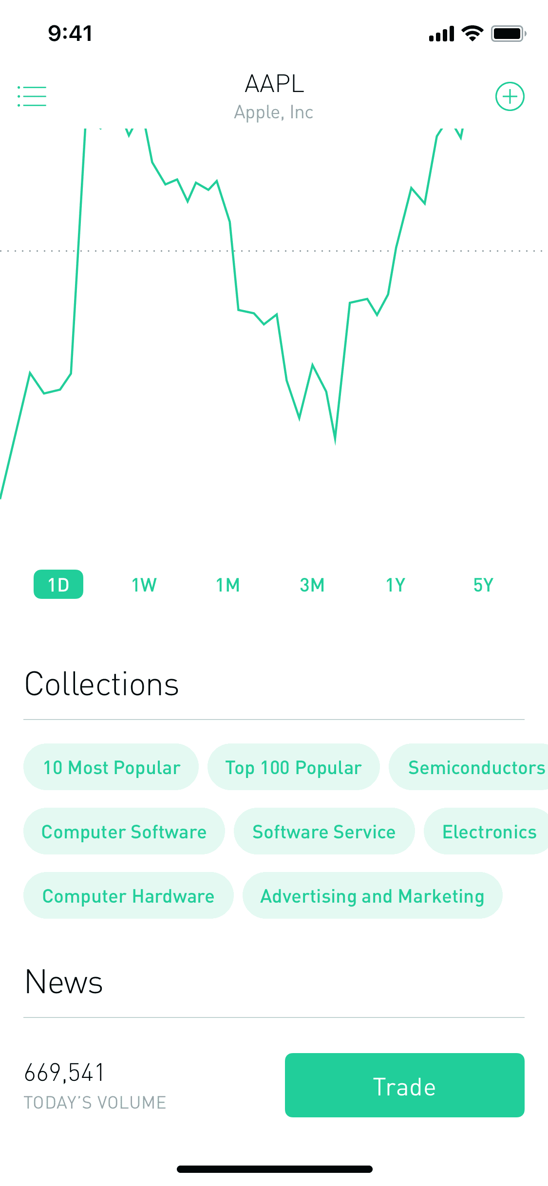
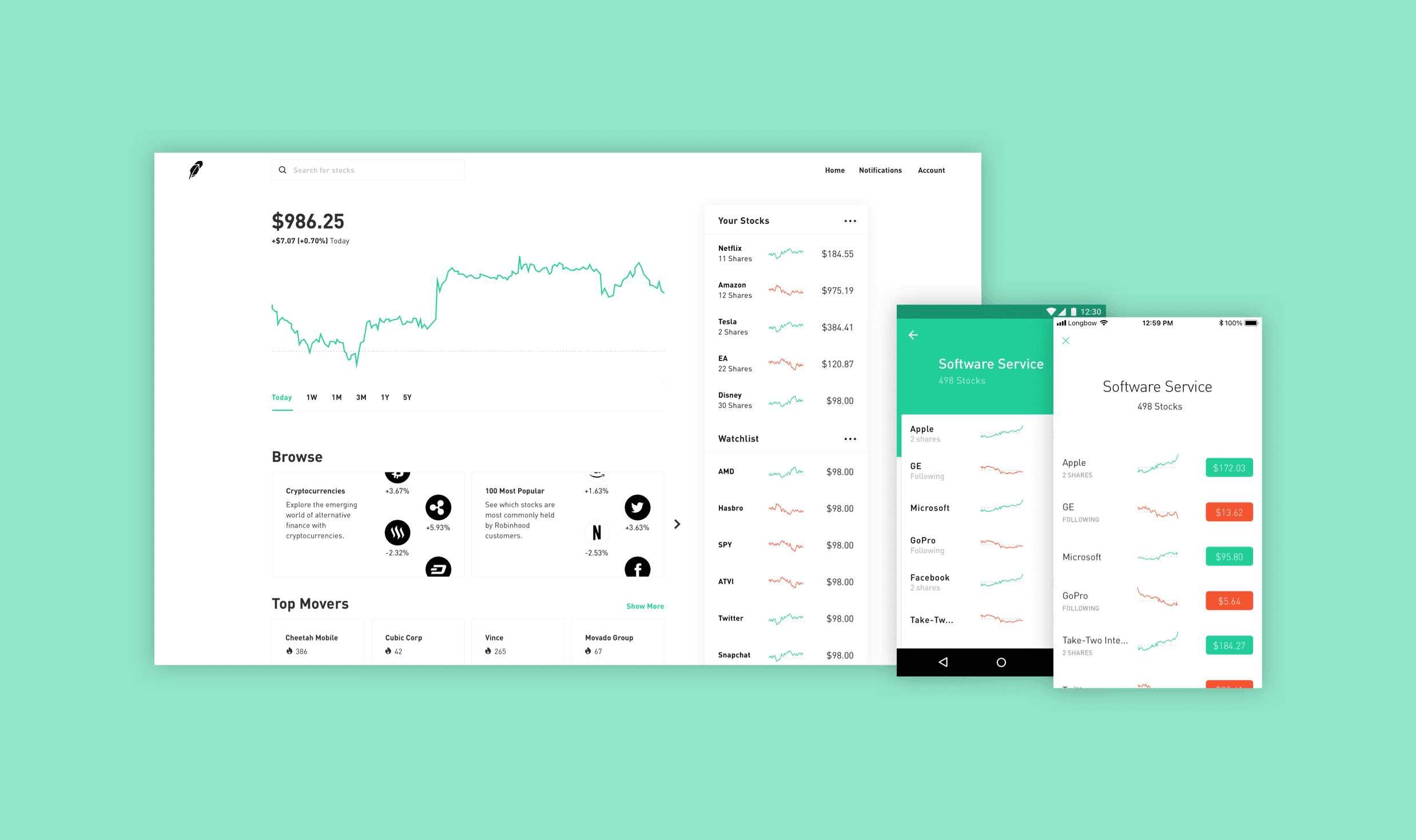
Previously, work had been done towards helping users discover what stocks are available to invest in on the app. Specifically, in the months leading up to this project, a feature on Robinhood for Web called Collections had been designed.

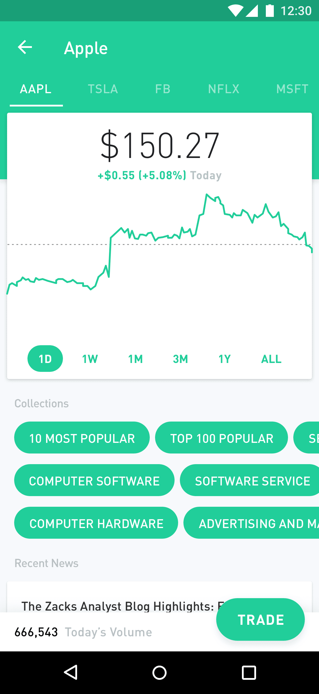
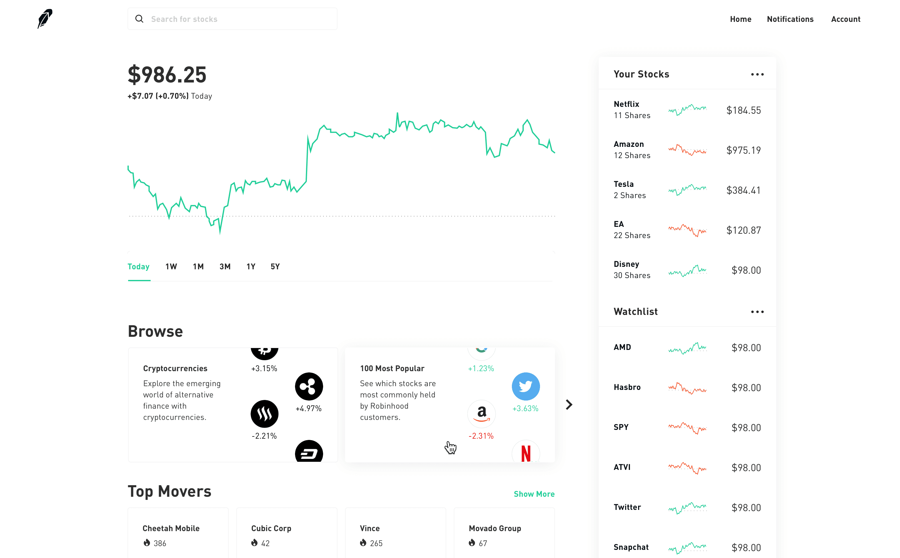
Robinhood Collections is a feature that helps users discover different investment opportunities by allowing users to search through different curated lists of stocks that relate in some fashion.

Prior research regarding Collections on the web product was overall positive with there being many active users of it. On the web product, Collections exist in three locations: on a stock detail, in search, and in a collection list view.

Initial Web

With this existing design for Collections on the web product, it was decided to not go through an end-to-end design process towards addressing the first user problem of discovery again. Instead, it was decided that we would introduce discovery on Robinhood's iOS and Android apps by first creating parity with the Collections feature on Robinhood's web app.

Previous design on mobile

Below shows what the initial design looked like before this project, where both iOS and Android apps did not have Collections yet.

Previous iOS Previous Android

Creating parity between web and mobile

The process of designing Collections for both iOS and Android largely consisted of designing different iterations for how the pill-shaped buttons would work on mobile while following design principles from Apple’s iOS Human Interface Guidelines and Google’s Material Design Guidelines.

New iOS New Android

Following the launch of Collections, Robinhood customers began writing positive comments about the new feature online:

Design process for solving user confidence

Once this initial portion of the project was complete and we had launched Collections on iOS and Android, it was time to begin thinking about how we can introduce education in order to help build user confidence; as outlined earlier, this was the second core problem many churning users faced.

This process consisted of a combination of reading user research, analyzing products from other companies that successfully engage users during discovery, developing prototypes that attempt to help users learn more about investing, and consolidating learnings from feedback received on those prototyped ideas.

Unfortunately, this project was cut short due to the Collections portion of this project being re-scoped to include additional features. With that said, our team learned a ton about how we can bring this aspect of user education to discovery.

For example, one prototype that was well-received is an idea that teaches users, on the empty-state of search, different investment strategies that are common for other investors that have similar goals and investment experience.

Inspiration for these prototypes came from an earlier project I worked on at Robinhood where we came up with a design that surfaces Collections on the homescreen of the web product, as shown below.

Web Collections Animation

Key learnings and future improvements

With much excitement, the first portion of this project of bringing Collections to iOS and Android was launched in the final few days I was at the company. This did, however, mean I was unable to see the impact Collections had on metrics.

Overall, internal feedback was positive and there was a feeling of enthusiasm to continue improving this area of the product. I’m excited to see where the product goes in the future, especially in terms of improving user education and evolving the way we help users to discover different ways to make money through investing.

Want to learn more about this case study?

Feel free to reach out by email.