Context
Rethinking the way meals are prepared
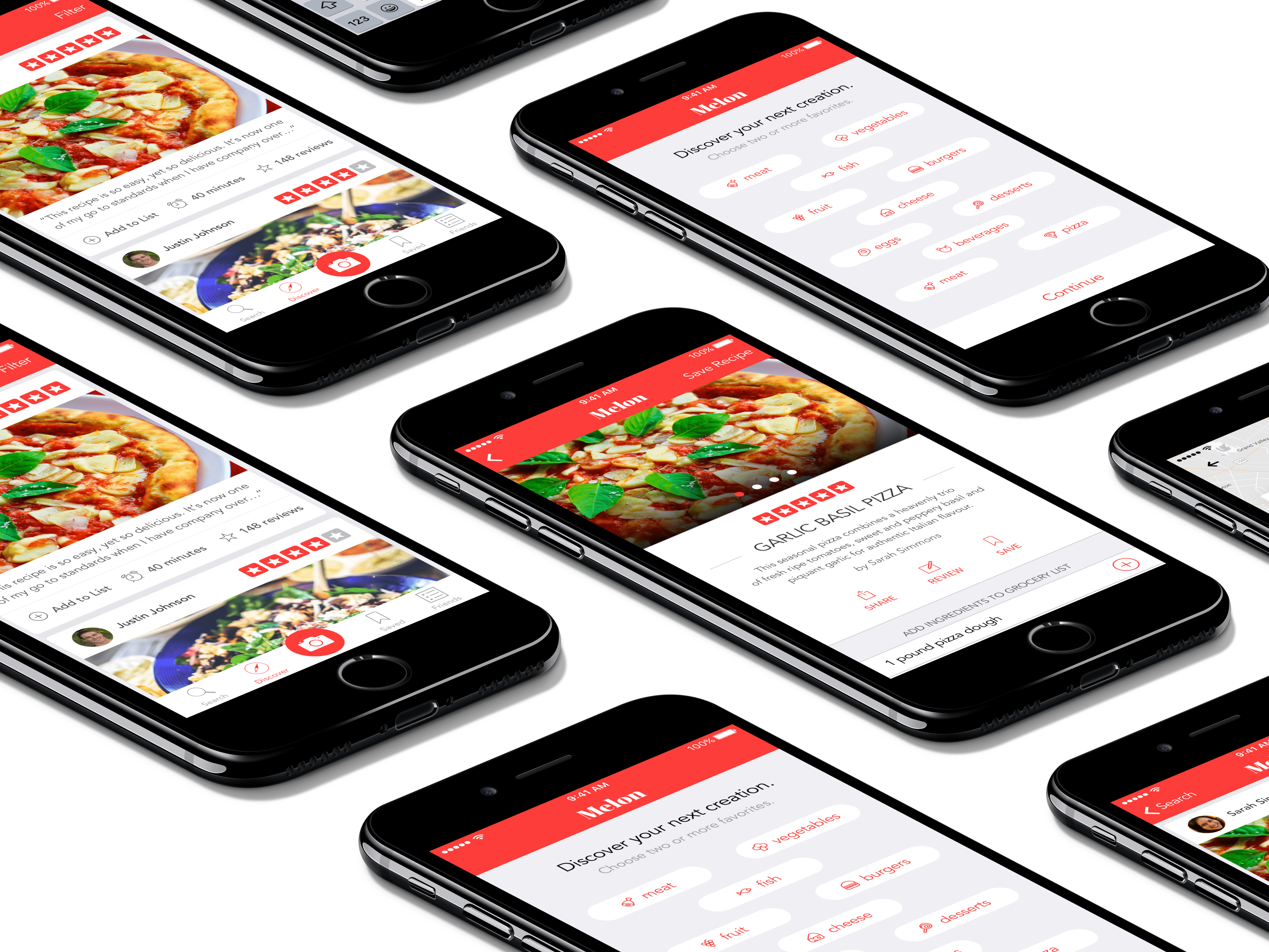
As part of a weekend design challenge I participated in I was tasked to design an application that allows people to discover, save, and share their favorite recipes. For this challenge, I was given the requirements the application should allow users the ability to find, save, and share recipes. Additionally, the design must include a recipes details and/or search page. My end goal for this project was to rethink the conventional way people prepare their meals by helping people learn to create new delicious meals.
The Problem
There is too many recipe options to choose from
Before diving into a solution to understand the problem, I noted down the many of the problems I personally endure every day when preparing food. The first problem that I had that related preparing my meals was that I often waste a lot of time looking at recipes with ingredients that I do not like or do not usually like to buy, in turn wasting time looking at recipes for meals I would never consider in the first place. Secondly, I wanted to see reviews from others who have tried cooking the recipe I am considering before. Finally, the last major problem that experienced was that I would often hear from friends and family that they tried cooking a certain recipe they found online that they enjoy it so much they make it every few days and I would value a way to be able see what recipes my friends and family recommend.
The Goal
Make discovering new recipes quick and personalized
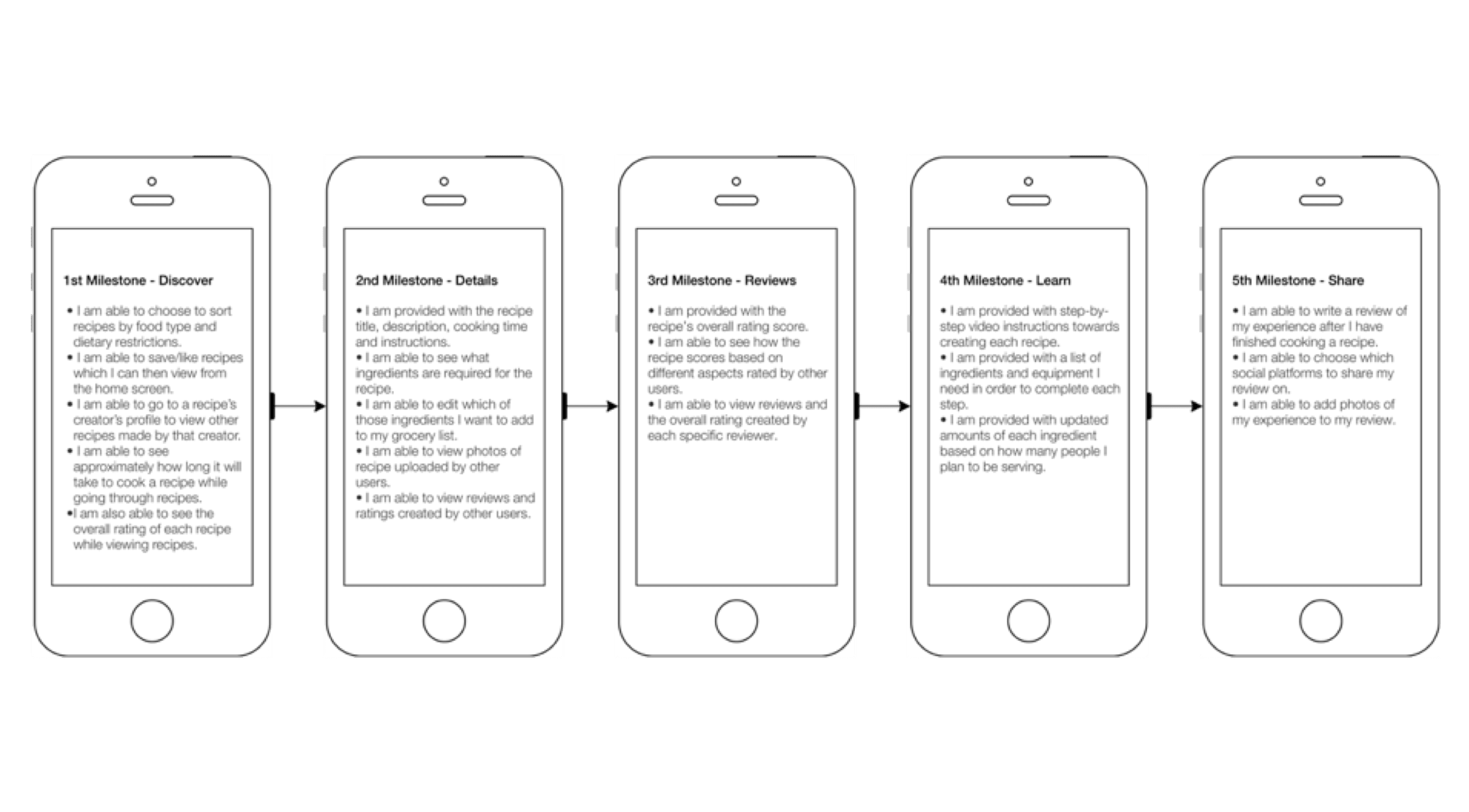
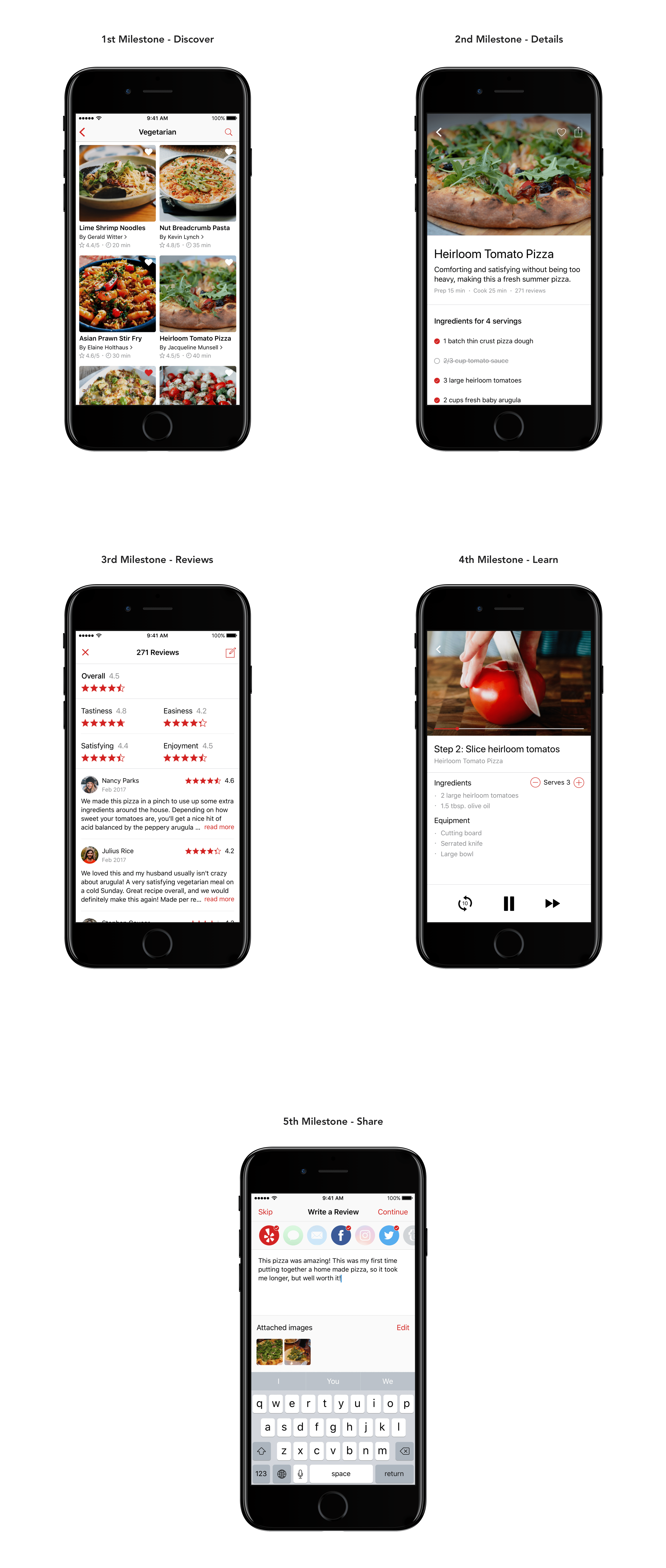
The instructions for this design challenge consisted of creating either a mobile or web application recipes detail and/or search page. Each recipe needed to have a title, multiple photos, a description, a shopping list, a how to section, share options, a rating, multiple reviews and user uploaded photos. Additional elements were encouraged to be added without the use of user research to assess my product thinking. Finally, the task did not encompass designing a complete flow but solely the essential features; meaning are encouraged areas such as account creation did not have to be addressed.
My Role
Learning to think from someone else's shoes
For this project, I worked as the sole product designer. I used this exercise to exercise my UX skills and tested what areas of my UX process are the most effective and what areas could be improved.
Business Goals
Providing enough value for users to consistently return
For this challenge two business goals were outlined as being the most important to keep in mind. The first was to focus on user engagement by encouraging users to come back to the app every day. The next goal was to optimize the design to get users to share the recipe with others that may or may not be on the platform currently would be encouraged to use the application.
User Goals
Keeping the user in mind throughout the entire design process
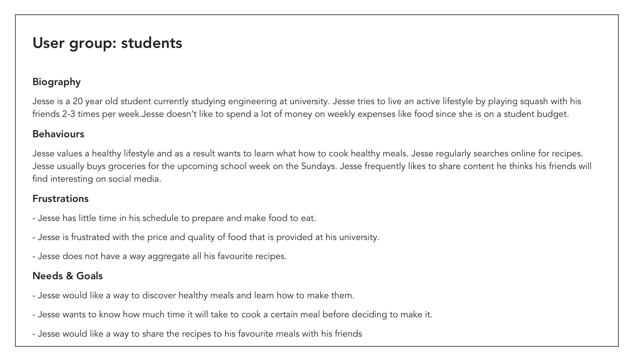
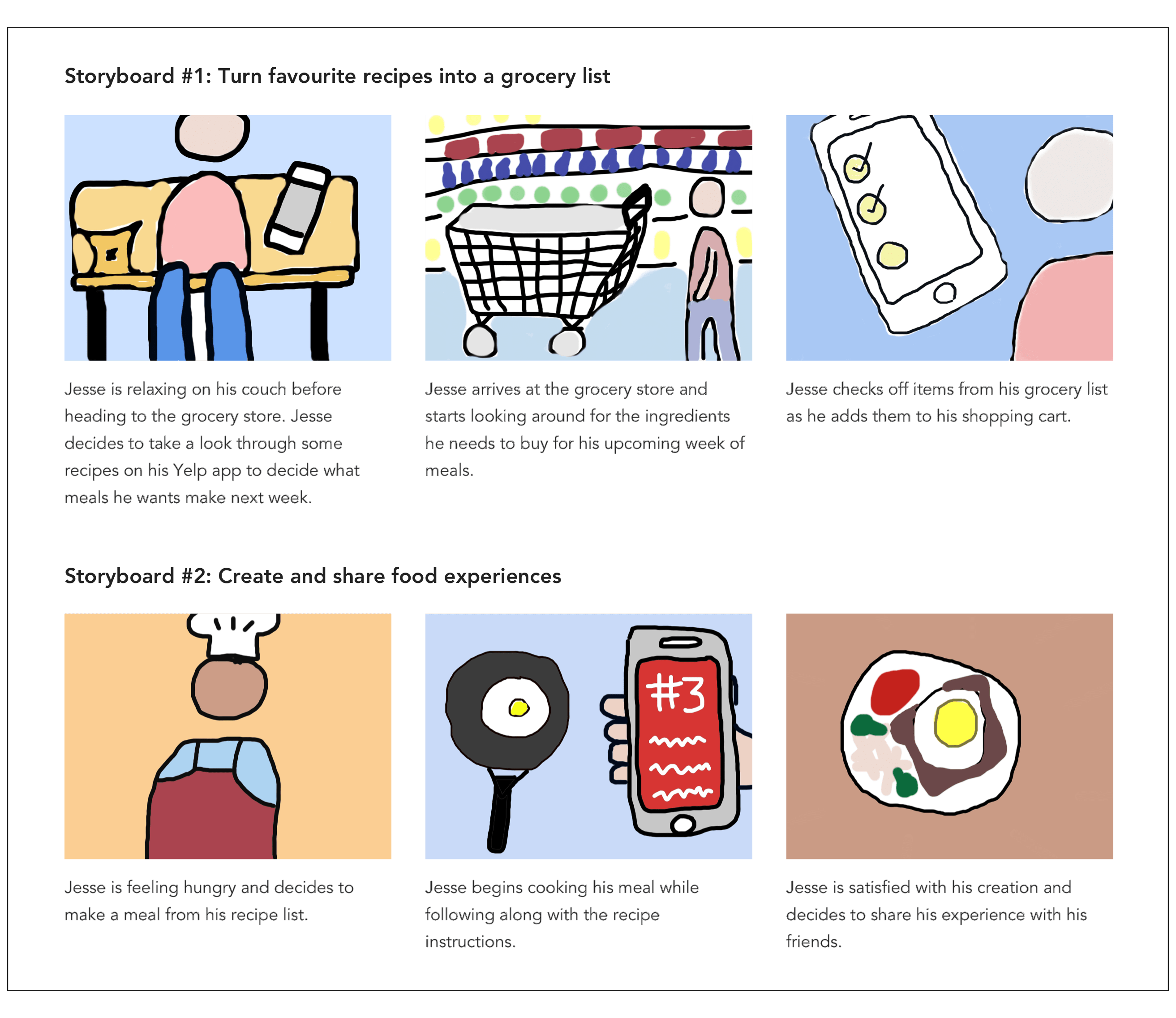
Given that I did not have the opportunity to conduct user interviews with users of the existing app, I prioritized my assumptions and tradeoffs using a proto-persona. I often find thinking through who I believe would be a target customer would be, with a proto-persona, is helpful in a couple ways when I don't have time or the availability of actual people. First I can gain an understanding of what a typical person that would be interested in a product like this is frustrated currently with their existing products allows me ensure I do not make the same mistakes in my design. Likewise, utilizing a proto-persona helps with understanding potential user needs and goals clarifies what features need to prioritized in my design.
